Key takeaways
- Give every learner a clear next step as soon as they sign in to your academy.
- Use Learner Pages, the sidebar, and visibility rules to personalize the experience without creating separate setups.
- Adapt navigation to different learner needs, from required training to course discovery and ongoing learning.
Your learners may enter the same academy, but they do not arrive with the same goal.
An employee may need to finish required training before a deadline. A partner may return for a certification course and supporting resources. A paying learner may want to continue where they stopped and find the next course that matches their interests.
When the signed-in space makes those actions hard to find, the problem starts before the learner opens a course.
Personalization after sign-in starts with a space that shows what matters and keeps the next action within reach. As your academy grows, doing this without more admin work gets harder.
LearnWorlds helps you shape that experience with Learner Pages, navigation, visibility rules, and tags. The learner sidebar keeps important pages and actions within reach across your school. Coming soon, learner agents will add tailored support and guidance inside courses.
This guide covers two main paths. The first is for internal training teams and organizations that provide learning without selling it directly to the learner. The second is for course sellers and commercial training providers that need to connect learning with retention, discovery, and future sales.
Personalization gets harder as your academy grows
Most academies begin with a short list of destinations. A topbar may be enough when learners only need to visit a course catalog, open one course, and manage their account.
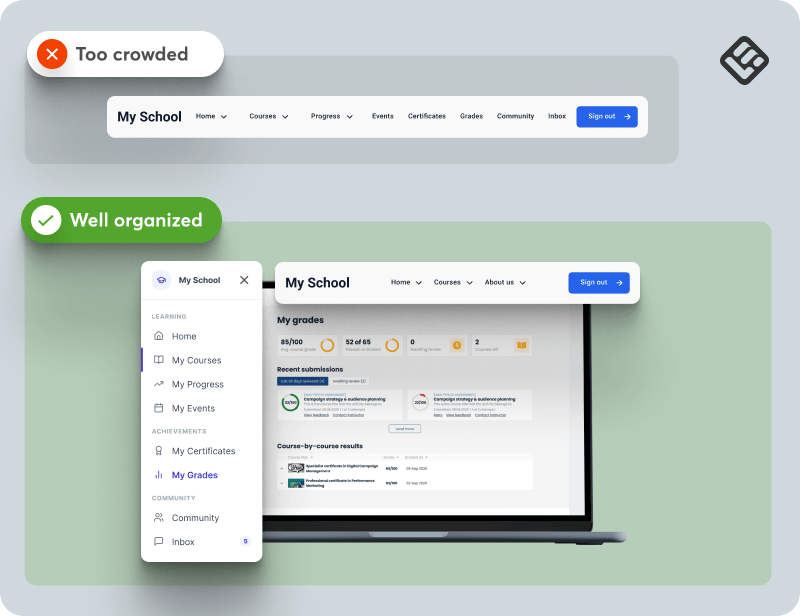
Growth changes that structure. Learners may need access to assigned courses, progress, grades, certificates, events, community spaces, support, and account settings. Adding every destination to the same topbar makes navigation harder to scan. Hiding too much creates a different problem because learners have to search for routine actions.
A useful signed-in space helps learners resume unfinished training and check progress. It also provides direct access to certificates, events, and support. Each visit should make the next action obvious.
The order of those needs changes by audience. An employee completing mandatory training needs a direct route to assigned content and current requirements. A course customer may need quick access to purchased courses, a certificate, and the next relevant offer.
The design should reflect that difference. Each audience needs a clear route through the same academy.
The tools behind a personalized signed-in experience
A personalized learner space works best when each element has a clear role. This helps learners find what matters without scanning the entire academy.
Use Learner Pages as the learner’s home base
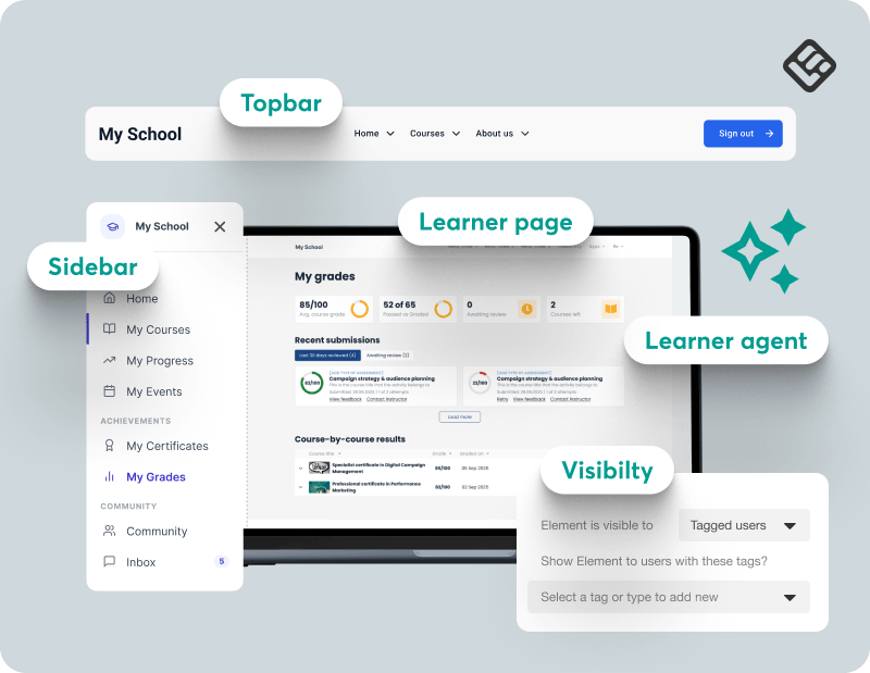
LearnWorlds Learner Pages bring each learner’s courses, progress, grades, certificates, events, and profile into one personal space. Use them as the after-login home base so learners can see their priorities as soon as they sign in.
Keep the topbar focused on broad navigation
Use the topbar for destinations that apply across the academy, such as the catalog or account access. Move repeat signed-in actions into the sidebar so the topbar stays easy to scan.
Use the sidebar for repeat learner actions
Give signed-in learners a consistent route to the pages they use most, such as their courses, progress, certificates, community, or support. Use menu groups or submenus to keep the first level focused.
Personalize with visibility rules and tags
Use visibility settings to show specific sections or widgets to logged-in users, tagged groups, or selected devices. One shared structure can then serve different roles, cohorts, or clients.
💡Review the user visibility settings.
Add in-course support with learner agents
Coming soon, learner agents will give learners tailored support inside their courses. The first version will introduce a didactic agent that can explain concepts and guide learners through course content.
Later versions will add more educational roles, such as tutors, coaches, examiners, managers, and role-playing partners, each with its own goals and behavior.
See how a personalized learner space works in practice
Follow the walkthrough to choose a sidebar layout, edit the menu, add a widget, and apply visibility rules to a tagged group. You will also see how to preview the learner view and save the result as a reusable template.
See how training teams can organize ongoing learning
For training teams, the learner’s next action is usually tied to an assignment, requirement, product, or organization rather than a purchase. The sidebar keeps those priorities easy to find across repeat visits.
Employee onboarding and required training
When employees need to complete assigned training, a long list of academy destinations can hide the action that matters. The sidebar can keep required learning, personal progress, and support within reach every time an employee returns.
A useful structure could start with Continue Learning, followed by My Courses, My Progress, My Grades, and My Certificates. Keep Support in its own group so employees can find help without scanning their learning records.
Use tags when different roles need different resources. New employees could see an onboarding link, while managers see leadership training or team resources.
The learner gets a consistent place to check requirements and continue. The L&D team spends less time directing people to the correct page.
Customer education and partner enablement
When customers or partners return for product training, they may also need certification, event information, community access, and help. A persistent menu keeps the academy useful after the first course is complete.
Consider links such as Learning Library, Certifications, Events, Community, and Support. Use separate menu groups so learning and help do not compete for attention.
Tags can support different partner types or customer groups. Each group can see the resources that apply to its program while using the same underlying sidebar.
Compliance and professional certification
When learners must keep training or qualifications current, access to records matters as much as access to course content.
Build the sidebar around Required Training, Assessments, My Progress, My Certificates, Events, and Support. Keep the link to current training near the top. Place records and help in separate groups so learners can find them without scanning the full menu.
This configuration creates a dependable route back to training status and certification records across a longer learning cycle.
See how course sellers and training providers can help learners return and find what’s next
Commercial academies need to help customers use what they have already purchased while giving them a sensible way to discover what comes next.
Course completion and next-course discovery
When customers return after buying a course, the first task is usually to continue learning. The sidebar should make that action immediate before presenting more choices.
Start with Continue Learning or My Courses. Follow with My Certificates, Explore Courses, and My Profile. If you add a promotion through a button or image widget, keep it secondary to the learner’s active course.
The experience supports course completion while leaving room for relevant discovery.
B2B commercial training providers
When you deliver training to several client organizations, each learner may belong to a different program or cohort. A shared generic menu can expose irrelevant destinations or make client-specific resources harder to find.
Use links such as Client Program, Assigned Courses, Progress, Certificates, and Support. Apply tag-based visibility to client-specific pages or support routes.
The sidebar remains consistent across the academy while each client group sees the links that apply to its training agreement.
Membership and community businesses
When your academy is a repeat destination, learners need more than a route into one course. They may return for events, discussions, resources, messages, and new learning.
Organize the sidebar into clear groups such as Learning, Community, and Account. Links could include Learning Library, Community, Events, Inbox, Resources, and My Profile.
Keep the first level short. Use submenus for secondary destinations so the main navigation stays easy to scan.
Large catalogs and continuing education
When learners need to choose from a large catalog, the sidebar can work as a second level of organization.
Create links to catalog pages organized around delivery format or subject, such as Live, Virtual Live, and On-Demand. Keep My Courses and My Certificates separate from discovery links so returning learners can reach their own content first.
This helps learners move between active training and the wider catalog without placing every category in the topbar.
Pro tips for a cleaner learner space
Below are a few suggestions you can follow to help keep your learners’ space clean.
Let the sidebar lead on selected signed-in pages
If the topbar and sidebar repeat the same links, remove the duplication. LearnWorlds lets you use a common topbar, a custom page topbar, or no topbar on a specific page. A focused after-login page can use the sidebar as its main navigation while public pages retain the topbar.
Save a layout once it works
Save a finished sidebar as a reusable template. This gives you a reliable version to apply again and reduces the chance of rebuilding the same menu differently later.
Return to a minimal structure when the menu gets crowded
If experiments leave the sidebar too busy, return to a simpler predefined template or rebuild from a blank configuration. Keep the learner’s most common action at the top, then add only the destinations that support it.
Personalize elements, not the entire structure
Use one shared sidebar as the foundation. Apply tag-based visibility to the menu items or widgets that need to change for a specific audience.
This keeps personalization manageable. You can update the common structure once while preserving the differences that matter to each group.
Keep temporary messages outside the navigation
Use a message inside the sidebar when it supports a learner’s next action or should remain close to their navigation across repeat visits. You can use visibility settings to show it only to a tagged group.
Use the Hello Bar for time-sensitive announcements, operational updates, or promotions that need more prominence across the academy. The Hello Bar sits above the topbar, so keep the topbar visible on the pages where the message should appear.
💡See how to configure the Hello Bar.
Give every learner a clear next step
Personalization starts with a useful home base, clear navigation, and a careful choice about what each audience sees after signing in.
Internal learners and paying customers have different reasons to return. Learner Pages, the sidebar, and visibility rules give you a shared structure that can support both. Keep required actions close, use tags for meaningful differences, and let every link earn its place.
Coming soon, learner agents will extend this experience inside each course with tailored interaction, support, and guidance.
Start with one audience and one question: what should this learner be able to do within seconds of signing in? Then consider how the same experience can support them before, during, and after each course.
Related Articles