Table of Contents
Creating a course landing page isn’t just about putting your product or service online. It’s about making a connection—showing your target audience why your course matters, what benefits it brings, and how it helps them take the next step.
If you’ve ever landed on a page that didn’t speak to your needs, you already know: not all landing pages convert. Some miss the mark with vague messaging, poor structure, or a lack of trust signals. Others simply don’t encourage visitors to take action.
A high-converting landing page for courses does more than look good—it guides potential customers through the key benefits, addresses their objections, and builds enough trust to help them commit. From your attention-grabbing headline to your final call to action, every piece of sales copy should be working together.
In this article, I’ll break down the key elements that make up an effective sales page for online courses. You’ll find real examples, layout tips that work on mobile devices, and ideas for how to structure both a long-form sales page and a shorter one—because what works for one course might not work for another.
What is a course landing page?
A course landing page is the entrance page of your online course. It is a no-distractions page to convert visitors into leads or customers.
The main purpose of a landing page is to convince visitors from an online marketing campaign to click the call-to-action button and complete a goal. To do this, the landing page presents specific and carefully-chosen information that encourages site visitors to receive your offer—whether this is the choice to opt-in or to buy your courses.
For online courses, a high-converting landing page includes the course title, information, learning objectives, instructor information, social proof, price, and other relevant information.
Landing page vs home page: What are the differences?
There are four factors that differentiate a homepage from a landing page:
As Neil Patel points out, the success of each type of landing page is found in their capability to:
From this perspective, one misstep in the visitor’s path online might make them leave your site. The solution to this is to design a landing page that takes website visitors straight to the desired result.
What does a course landing page do?
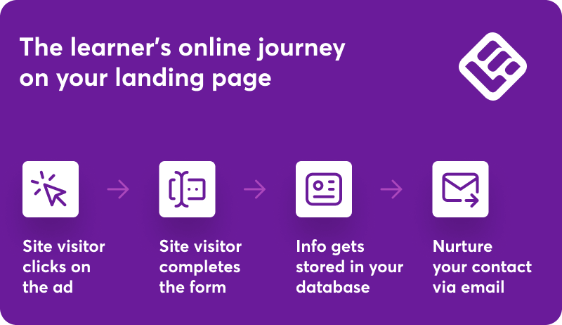
Landing pages are one of the major components of the sales funnel, focusing on a single user action. That would be to:
Each key element on the landing page has a dedicated role. The role of a landing page during the steps of a learner’s online journey fits as follows:
Why do you need a landing page for your online courses?
A landing page serves one purpose. Different landing page types serve different purposes. A landing page addresses your audience’s pain points and includes the call-to-action that will lead them towards the next step in the funnel.
Most straightforward landing pages will push people towards buying instead of getting leads (eg selling online courses). You can guide visitors through other steps, like:
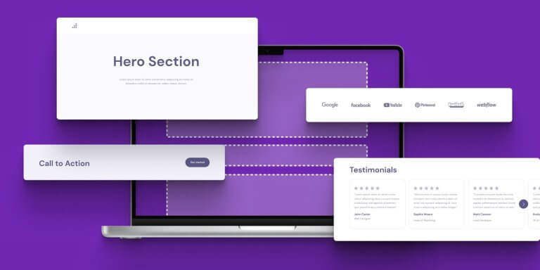
Key components of a high-converting course landing page
There’s no one-size-fits-all when it comes to creating course landing pages, but most successful pages share a few essential elements. These are the building blocks that help you connect with your target audience, guide them through the customer journey, and ultimately convert interest into action.
Whether you’re working with a long-form sales page or something shorter, here’s what every compelling sales page needs to include.
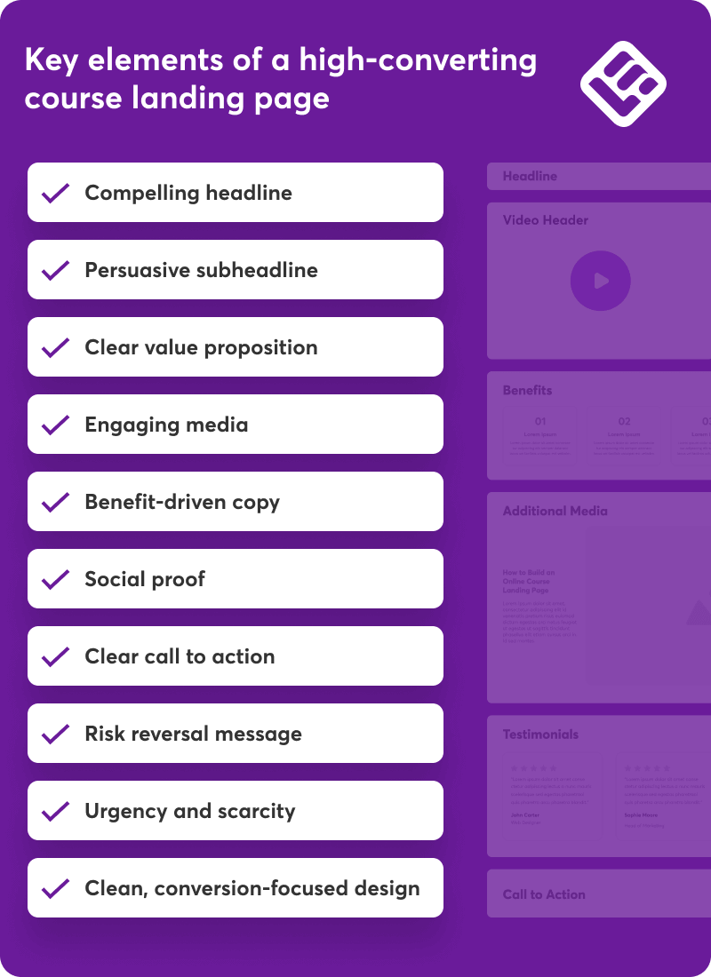
Compelling headline
Your headline is your first impression—and on an online course landing page, it has to work hard. Think of it as your front door. It should grab attention, speak to a real pain point, and offer a promise your reader cares about.
Instead of “Welcome to my course,” try something that highlights a clear benefit:
“Go from zero to launch: Build your first course in 30 days—even if you have no audience.”
A strong, attention-grabbing headline doesn’t just sound good. It pulls people in and encourages them to keep reading.
Persuasive subheadline
If the headline draws them in, your subheadline seals the deal. It adds clarity, reinforces your offer, or creates a sense of curiosity. You can use it to answer an immediate question (“Who is this for?”) or support your value proposition with more detail.
Example:
“Created for coaches, consultants, and creators who want to turn their expertise into digital products that sell.”
Clear value proposition
A great value proposition is simple, specific, and outcome-driven. It tells people what they’ll get, who it’s for, and why it’s worth their time or money. This is especially important if you’re offering a digital product, like a course or membership.
Use this section to highlight:
Make it scannable. Use bullet points to call out the most important information. This helps users on mobile devices absorb your message faster.
Engaging media
A high-converting landing page for courses doesn’t rely on text alone. Visual content—like images, video walkthroughs, or course previews—helps visitors better understand your product or service and builds trust.
Use high-quality visuals that show your course in action or reflect the outcomes your learners can expect.
If possible, include:
On mobile devices, make sure your visuals are responsive and don’t slow the page down. Visuals should support your message, not distract from it.
Benefit-driven copy
Don’t just describe what your course includes—focus on how it helps. Effective sales copy is rooted in outcomes.
Here’s what Chase McKee, Founder & CEO, Rocket Alumni Solutions – Digital Record Board, says about the benefit-driven copy: “I’ve built Rocket Alumni Solutions to $3M+ ARR, and the biggest conversion breakthrough came when we stopped talking about our software features and started showcasing actual donor impact stories. Our sales pages now lead with real testimonials and data from partner schools rather than technical specs.”
The copy landing page framework that actually works
According to Chase, this is the framework that works: Problem → Real Story → Specific Results → Clear Next Step.
He says: “For example, instead of ‘Advanced touchscreen technology,’ we wrote ‘When Lincoln High’s alumni director Sarah couldn’t track down former record holders, we helped her create digital displays that brought back 40% more donors to their annual giving campaign.’ That story-driven approach boosted our demo close rate to 30%.
Here’s what most people get wrong—they think conversion is about the page design or clever copy. It’s actually about proof that you’ve solved this exact problem before. We started including specific metrics like ‘25% increase in repeat donations’ and ‘80% YoY growth’ right in our headlines because numbers cut through skepticism faster than promises.
The tactical move that changed everything: I personally recorded 2-minute video testimonials with our happiest clients and embedded them above the fold. Seeing real school administrators explain their results in their own words converted visitors way better than any sales copy I could write.”
Make sure to highlight the benefits customers will experience, not just the key features. For example:
Use bullet points to break down value and keep your copy easy to scan. Always write with the reader in mind: How will this course improve their life, solve a problem, or help them achieve something meaningful?
Social proof
People trust people. Adding social proof—in the form of customer testimonials, reviews, or success stories—can instantly make your page more credible. When others talk about your course’s results, it helps reduce doubt and builds confidence.
Try including:
If your course has been featured on platforms or in the press, this is also a great place to mention it.
Clear call to action
Every online course landing page needs a clear next step. Your call to action (CTA) should be direct, specific, and easy to spot. Use action-oriented language that focuses on the result, like:
Repeat your CTA throughout the page—especially after major sections—so your reader never has to scroll too far to act. On mobile, make sure your button stands out and isn’t buried between blocks of text.
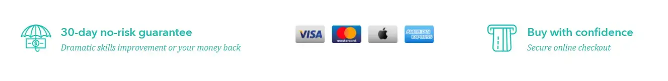
Risk reversal message
One of the most common customer objections is fear—fear of wasting money, time, or energy on something that doesn’t deliver. A simple way to reduce that friction is by offering risk reversal.
Think:
If you’re confident in your course, show it. By removing the pressure, you encourage visitors to commit with less hesitation.
Urgency and scarcity
Even the best sales pages can lose conversions if the offer feels like it will always be there. People need a reason to act now. That’s where urgency and scarcity come in.
Use tools like:
A real story about how urgency and scarcity work for great landing pages
Here’s what Randy Speckman, Founder of TechAuthority.AI says about urgency and scarcity: “My agency tested over 500 landing pages for small businesses, and the biggest game-changer wasn’t fancy design—it was implementing countdown timers on offers. We found this accidentally when a client’s flash sale timer kept running past the deadline, and conversions stayed 3x higher than normal.
The framework I swear by: Create genuine urgency through limited-time bonuses rather than fake scarcity.
For one e-commerce client, we replaced their generic ‘Buy Now’ with a 48-hour timer offering free expedited shipping. Their conversion rate jumped from 4.1% to 11.3% because people had a real reason to act immediately instead of bookmarking for later.
Here’s the tactical piece most agencies miss: Position your urgency element right above the fold, not buried with your CTA. We moved one client’s timer from the bottom of their sales page to directly under their headline. This simple repositioning increased their email capture rate by 67% because visitors saw the deadline before they started reading the benefits.
The real breakthrough came from A/B testing urgency language. Instead of ‘Limited time offer,’ we used ‘Bonus expires in:’ followed by the countdown. One fitness coach client saw her course sales increase 180% in one month because the timer focused on what they’d lose (the bonus) rather than pressuring them to buy.”
Use urgency honestly. This isn’t about manipulation—it’s about helping motivated people take timely action on something they already want.
Clean, conversion-focused design
Design supports everything else. A messy layout, too many fonts, or walls of text can turn visitors away—even if your offer is strong.
A high-converting course landing page should:
You don’t need flashy graphics. You need clarity. Make sure the user journey is simple and distraction-free, especially when someone is close to making a decision.
Optimization tips to improve your online course landing page performance
Even the most stunning online course landing page can underperform if you’re not testing and improving it regularly. Optimization isn’t just for launch—it’s an ongoing process that helps you adapt to your audience, fine-tune your sales copy, and make sure your web page continues to convert.
Here are a few ways to approach it:
18 great course landing page examples
We’ve meticulously curated top-tier and high-quality online course landing page examples from various academies across the web to fuel your inspiration.
Below, you will find examples of LearnWorlds’ capabilities, as most academies are hosted on LearnWorlds.
You can also create your own online course with LearnWorlds. Start with a free trial.
1. Calisthenics – Muscle Up
Goal: Subscription trial signup
Category: Fitness

The School of Calisthenics stands as a prime example of an academy that excels in design consistency, employs concise and captivating titles, incorporates engaging video introductions, and integrates actionable language in its titles.
Furthermore, the academy leverages instructor profiles, strategically positioned at the bottom of the page, to establish professional credibility and provides a clear call to action for a compelling 7-day free trial, enticing visitors to progress.
However, in the pursuit of perfection, a couple of enhancements could be considered:
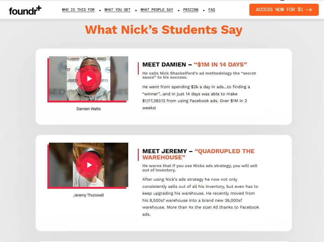
2. Foundr
Goal: Course sales
Category: Ecommerce
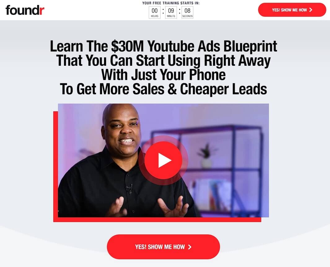
Foundr uses a very salesy approach to sell online courses to entrepreneurs in the ecommerce space. They focus on celebrity instructors and strong, professional video introductions for their courses, multiple CTAs, benefits sections, and social proof.
A very notable feature is their video testimonials that many of their courses have. They supplement the videos with the person’s name, the result they achieved, and a longer description of their personal story.
Foundr’s course pages are great examples of high-performing landing pages. But keep in mind, in some industries, having too many CTAs can make it seem like you’re more interested in quick sales than in offering a valuable course. This is especially true if you don’t have a famous instructor backing you up. So, it’s a good idea to be cautious with how many CTAs you use.
3. Code and Compile
Goal: Lead capture
Category: Factory automation
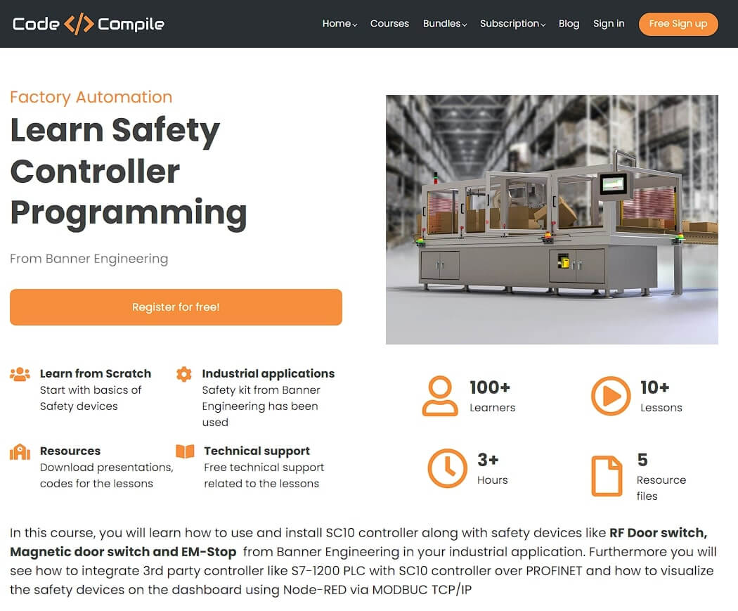
Embracing a conventional yet highly effective course landing page design, ‘Code and Compile’ adopts a time-tested format. It commences with a value-centric title, followed by articulating the course’s advantages and particulars. A preview video offers a glimpse, complemented by a comprehensive course outline below.
This entry-level course serves as a lead generation tool, collecting student contact information, which paves the way for upselling to more advanced courses.
4. Masterclass
Goal: Annual subscription
Category: Edutainment
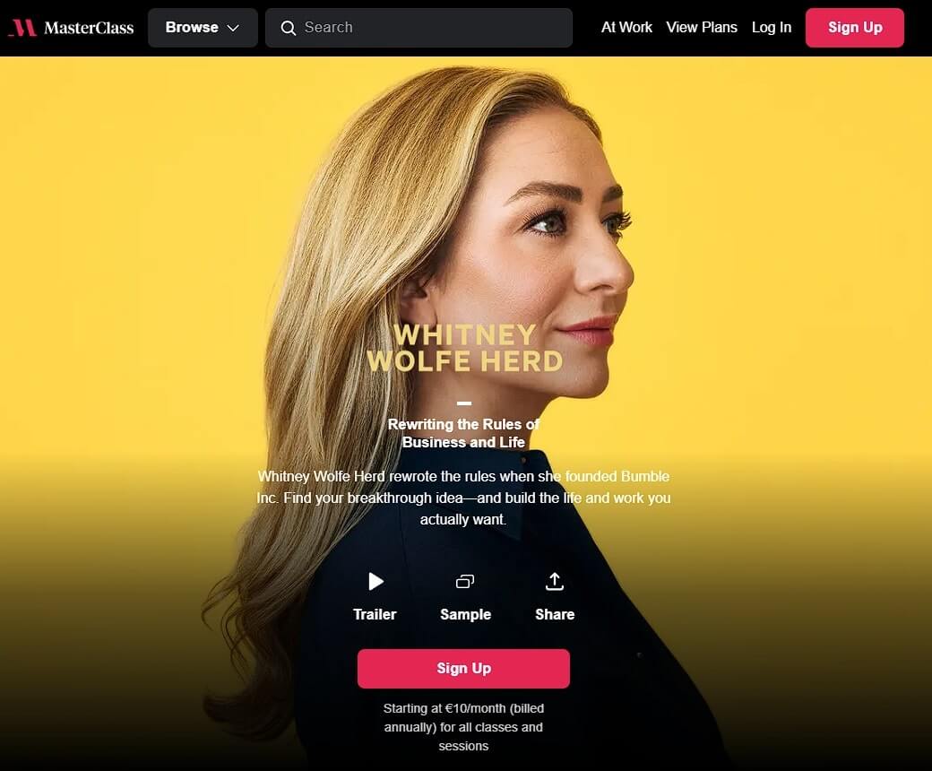
Another membership site with hugely popular online courses is Masterclass, which uses a Netflix-style edutainment (education + entertainment) model. Due to their famous instructors, the above-the-fold focus is a famous instructor.
Above is a trailer and a video sample of the course. Masterclass also has testimonials on their pages on top of showcasing other famous instructors below as part of their social proof.
Similarly, the headlines focus on the instructor rather than the course topic, with a very simple and clear “Sign up” call-to-action at multiple places.
As an exception to the above examples, Masterclass offers a corporate subscription, and thus adds a secondary CTA leading to a contact form with the call-to-action “Level Up Your Team”.
5. Better Lettering Course
Goal: Direct course sales
Category: Creative skills
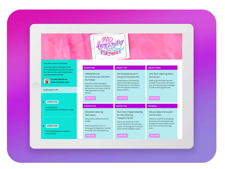
The Better Lettering course is for beginners who want to get better at lettering, and the name of the course says it all. Its unique value proposition is communicated at the top of the page, and the solution it offers is teaching the basics of the art of hand-lettering.
The choice to keep the background white helps to make the landing page clean and clutter-free. The call-to-action – CTA button, is blue so that it stands out and fits with the rest of the graphics on the page, but also the colors of the brand.
What’s interesting about this course sales page is that it uses the lettering artwork examples of the creator, Caroline, to guide the website visitor to scroll through the page and take the appropriate action.
Caroline takes good advantage of the visual element and brings creativity to the forefront. Besides, this is what the course is all about. She also takes the time to explain what is inside the course and lists the lessons included.
6. One Funnel Away
Goal: Challenge signup / lead capture
Category: Sales funnels / marketing
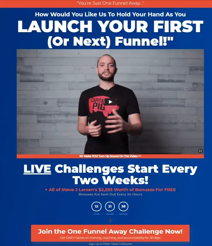
Steve J. Larsen’s ‘One Funnel Away’ is calling out to his target audience, encouraging them to sign up for a challenge. In doing so, he lets people know that the course’s resources are worth a lot of money, but they come for free, which is a great incentive for those who want to learn more about sales funnels.
Steve makes sure to present this challenge as the easiest way to create sales funnels, and his course ‘One Channel Away’ helps to remove those mental blocks that may be preventing students from enrolling.
He also makes it super easy to opt in, adding a lead capture pop-up form that allows people to register for the course and get additional bonuses for free.
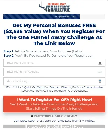
Apart from that, adding a countdown timer on the landing page is an awesome way to urge people to enroll. In this example, it is a must, since the course is repeating and accepting students every 2 weeks.
7. PRISM (PR Couture)
Goal: Direct course sales
Category: Public relations / career development
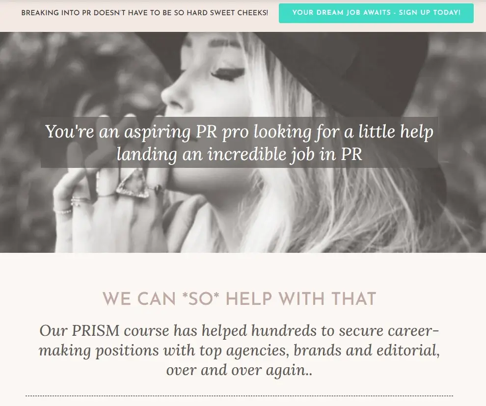
The PRISM course by PR Couture tells you what it can do for you right away. So if you want to ‘break into PR’ and ‘you are an aspiring PR’, you can ‘land an incredible job in PR’ with ‘a little help’ from them.
The copy here is spot-on, not only because it is relevant to the PR industry, but also in the way it uses positive language and addresses the target audience directly. It appears to be strong, confident, and trustworthy, allowing people to let their guard down and believe what is being said on this page.
The cyan color on the CTAs makes it stand out from the rest of the elements on the page, which are mostly decorated with nude-like color shades.
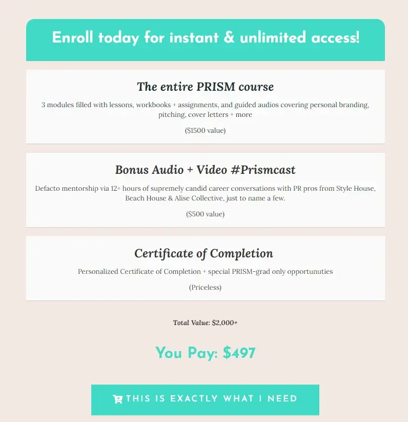
Crosby – the founder of PR Couture, believes in her course, and she isn’t afraid to show it. As you scroll through the page, you will see that she breaks down her course, showing people the value it comes with each package.
What comes as a surprise with this landing page is that it presents the certificate of completion as an extra asset that people can take from this course. How much does it value? Well, it’s definitely priceless.
8. Creator Pass (ConvertKit)
Goal: Course sales / subscription
Category: Online business and marketing
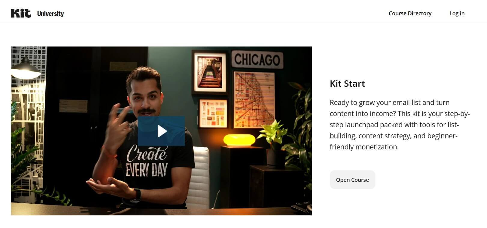
ConvertKit – one of the most popular email marketing platforms in the market – features Kit University, an online space that can help creators build a successful online business and grow their income. ConverKit’s course sale page is not as long as others from this list, but it is equally powerful.
Its minimal web design elements give out more information than intended and help people get what they need.
To get people’s attention right away, ConvertKit starts with a question – ‘Ready to grow your email list and turn content into income?’ and then it gives the solution that most aspiring entrepreneurs need.
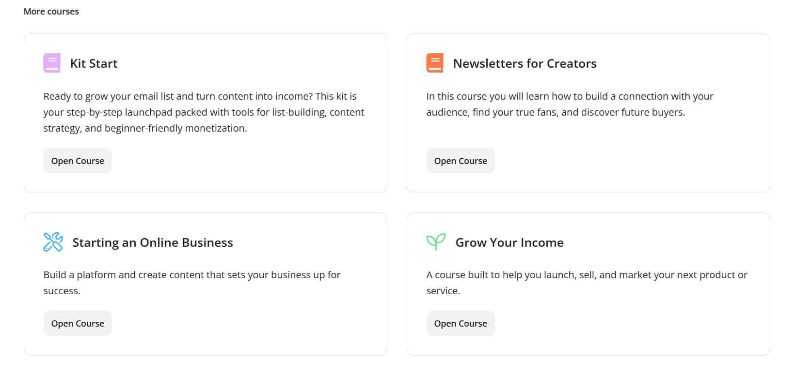
At the bottom of the page, ConvertKit makes extensive use of CTAs – ‘Open Course’ as well. Adding multiple CTAs can help, especially when directing visitors to other products (see ‘more courses’), which can help them get to the solution they need faster.
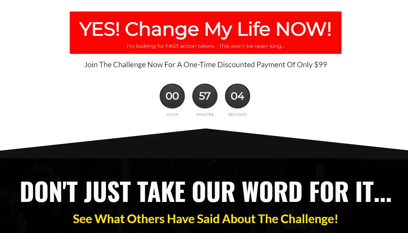
9. The 21/20 Healthcare Challenge
Goal: Course sales
Category: Healthcare / professional development
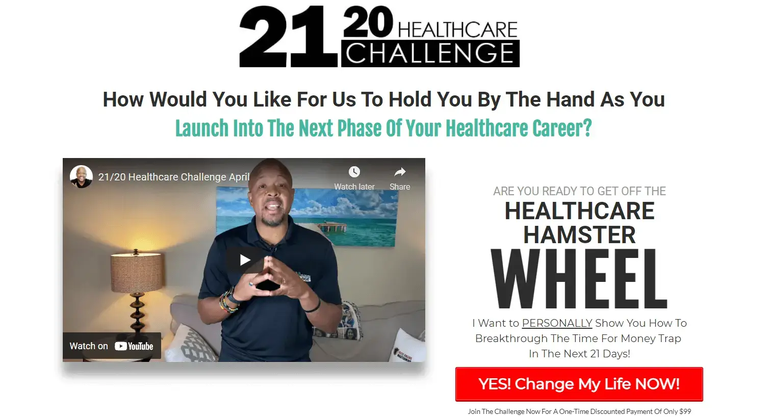
Greg Todd’s 21/20 Healthcare Challenge is exclusively for healthcare professionals and aims to help them achieve better in their careers. As a healthcare mentor, business and career coach, Greg is able to communicate his knowledge and expertise using his sales webinars, both at the top and bottom of the web page.
Since video is more direct, it helps people understand what’s inside this course right away.
Throughout the page, Greg uses different types of fonts, font sizes, and colors, but also adds some capitalized letters to draw more attention to specific parts and words. To make the red CTAs stand out even more, he makes them pop or jump using special motions.
Greg doesn’t stop there, and he creates a series of video testimonials from customers who have taken up the challenge course and loved it.
Overall, this is another great course landing page example that shows just how the landing page design you choose can influence the consumer’s decision. As Greg divides a section with a big arrow, he guides the website visitor to click on the action button.
Want the same effect with your course landing page?
Try out LearnWorlds website builder, which is like no other landing page builder, that allows you to add section dividers, widgets, pop-ups, and many other cool elements on your landing page.
10. The 10x Emails and Six Figure Emails
Goal: Direct course sales
Category: Copywriting / business growth
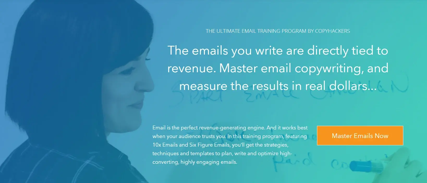
This landing page features two courses, 10x Emails and Six Figure Emails, that can help anyone master email copywriting. Created by Joanna Wiebe and Ry Schwartz, these two courses are bundled together and can help people further grow and scale their businesses.
The way both courses are presented on the landing page allows website visitors to get key information about each one. Going through the modules, the page explains each step-by-step, giving them a general idea of what they can expect to learn.
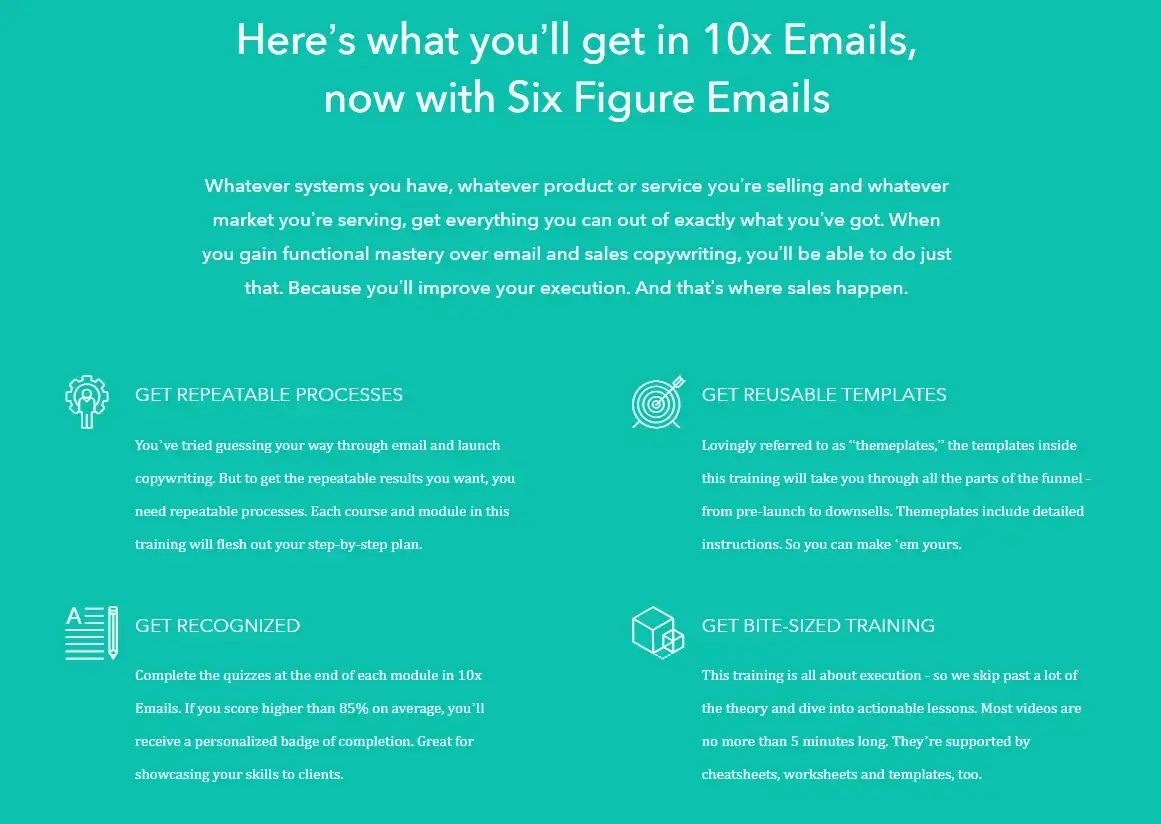
Apart from the learning aspect, though, the course creators focus on the benefits of completing the courses. Getting more recognition, bite-sized training, reusable email templates, and learning all the processes of writing effective emails is more than any would ask for.
Since most people are reluctant to pay for any product online, it is important to ensure that they can carry out ecommerce transactions with confidence. Letting them know that—like Copyhackers do in this course landing page example— increases your chances of making a sale.
11. Lewis Howes
Goal: Course sales / community growth
Category: Personal development / business coaching
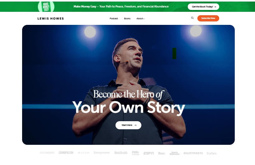
Lewis Howes, the person behind The School of Greatness, is a New York Times bestselling author, lifestyle entrepreneur, and high-performance business coach. His story and the obstacles he met along the way of building his own business are what make him unique, but also give him the ability to help other people achieve greater things in life.
With a single browse on Lewis’s website, you can tell he is the person you need to become better at any aspect of life. Whether it is business, relationship, family, or health advice, or inspiration you need, he has got it.
Lewis manages to make this clear by welcoming you to his page and making sure to get across an empowering message, ‘Become the hero of your own story’. Meanwhile, the story he shares and the images he uses are drawn from real life and have a way of giving authenticity, honesty, and trust.
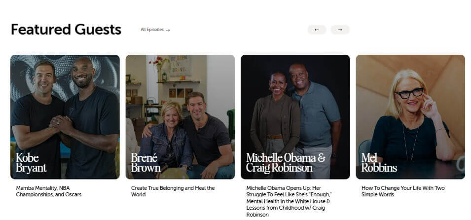
Apart from that, across the page, he makes sure to give the visitor the topics he can provide solutions for – some of which are money, relationships, mindset, and health. He shares a list of episodes visitors can watch and his featured guests (Michelle Obama included).
12. Mari Smith
Goal: Course sales
Category: Social media marketing
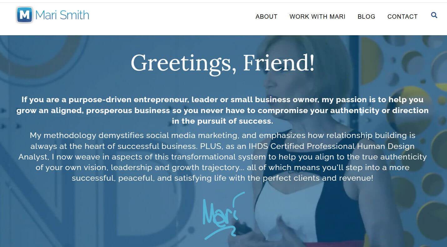
Mari Smith, who is often referred to as the “Queen of Facebook,” knows everything there is to know about Facebook marketing and offers her expertise to small businesses, brands, and direct sales organizations. As a social media thought leader, Mari provides in-depth consulting and training on Facebook, Instagram, and Messenger marketing best practices, catering to both beginners and more experienced audiences.
Through her landing page, Mari manages to do many interesting things. Firstly, she gives out a value proposition through her copy in the hero section that focuses on her unique selling point while introducing herself to potential customers.
This way, Mari tells them what she can do for them right away while focusing on the benefits, which works as a great hook. Targeting the customers’ pain points and offering an immediate solution is an effective strategy because it makes it all about the customers – what they can expect to get from her.

Mari then lists all of the ways in which she can help her audience, talks about her story, and offers a free resource. She also includes a list of popular sites like Forbes, Fast Company, and The New York Times, which she was featured in or worked with. This boosts her credibility status massively, giving her more authority as a marketing expert.
13. Gary Vaynerchuk
Goal: Newsletter signup / event promotion
Category: Business / marketing / personal branding
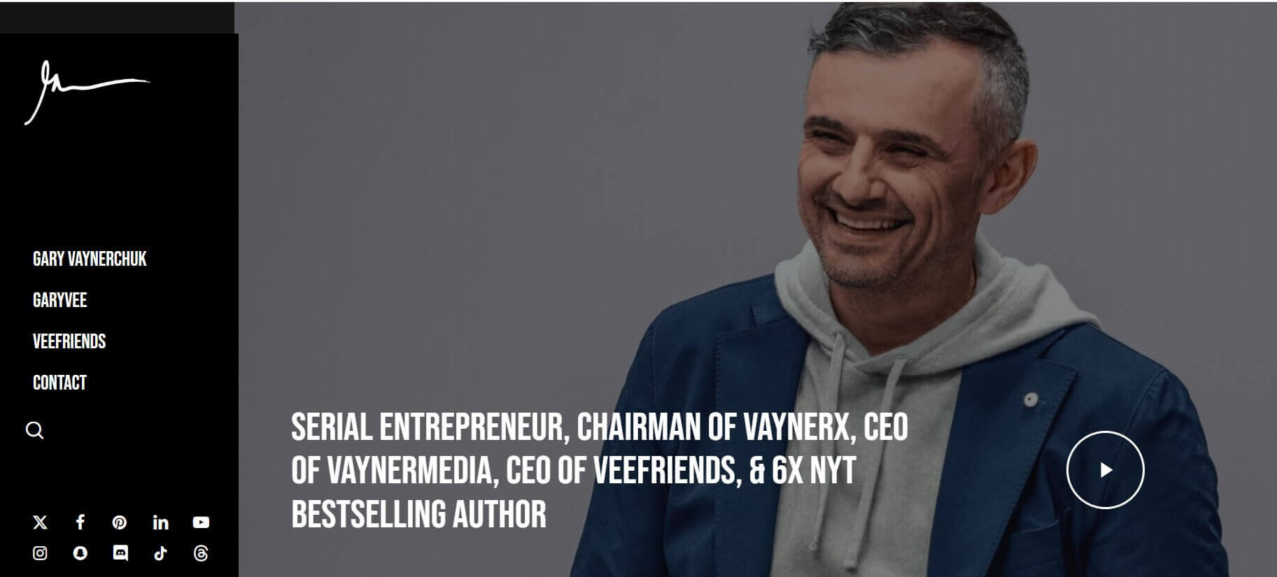
Founder and CEO of VaynerMedia, Gary Vaynerchuk is more than an entrepreneur. As a social media guru, internet personality, and a born-to-be businessman owning more businesses than we can count, Gary has built a powerful coaching skill set. His extensive knowledge of business and business marketing has made him a huge success and celebrity.
On his website, he makes sure to tell people who he is and what he does, and prompts them to sign up for his weekly newsletter. Apart from that, he lists all of the events he plans to appear at and makes sure to share his contact details for those who want to reach out.
Also, Gary gives much of his focus to social media, sharing his social profiles, connecting with his audience, and building an interactive experience with them.
14. Pat Flynn
Goal: Course sales and resource promotion
Category: Online business / entrepreneurship
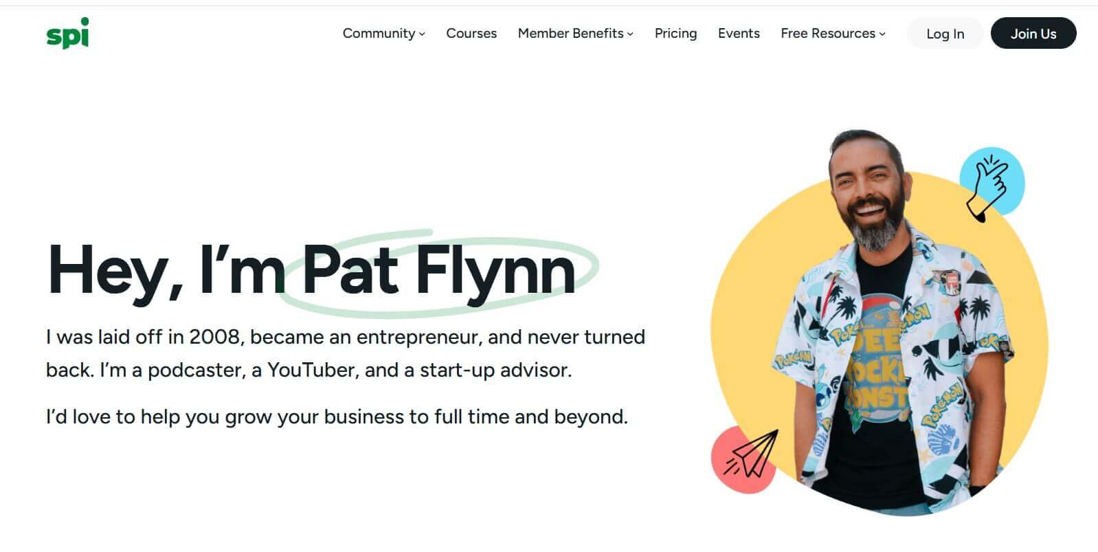
Pat Flynn is the founder of Smart Passive Income, an organization that helps people—especially online entrepreneurs—realize their dreams while building purpose-driven and profitable businesses. Over the years, what started as a small blog for Pat grew out to be a successful company with a vibrant community of people willing to help others.
By looking at SPI’s website, you can tell there is a great balance of content marketing elements, and this becomes evident early on through the hero section. The landing page is very clean and follows a definite structure that makes it super easy to navigate and get the information you need right away.
The careful selection of the colors—green, white, some yellow and light blue-green shadows— also makes all the difference, effectively highlighting the copy, images, and brand.
Even though it is a long page, Pat manages to divide it into small sections featuring articles, podcasts, courses, free guides, workshops, and other resources.
15. Russell Brunson
Goal: Community growth and course sales
Category: Sales funnels / marketing
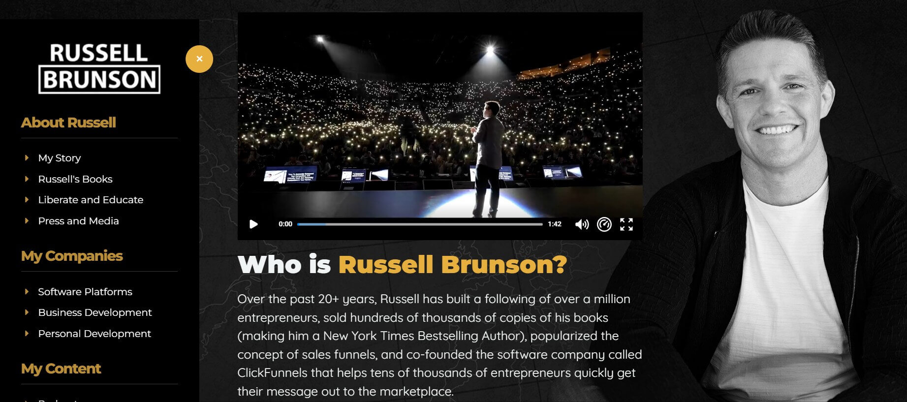
Russel Brunson—co-founder of ClickFunnels—is an expert on building sales funnels. Through his work, he has and is still helping entrepreneurs get their message out to the marketplace quickly. As an online marketer, he managed to sell more than 400,000 copies of his marketing books. By 2020, Russell’s training, teaching, and software have helped thousands of millionaires who are now members of his exclusive club – the Two Comma Club.
Russell knows that adding videos to landing pages improves conversions, and this is definitely working in his favor. Russell makes great use of the video on his website. The video that explains who Russell Brunson is is the first thing that website visitors get to see once they land on his page.
Since it is more direct and engaging than any other type of media, video has the potential to capture leads and encourage them to stay longer on the page. And, the more time people stay on the page, the higher the possibility of converting.
16. Marie Forleo
Goal: Course sales and community growth
Category: Personal development / business coaching
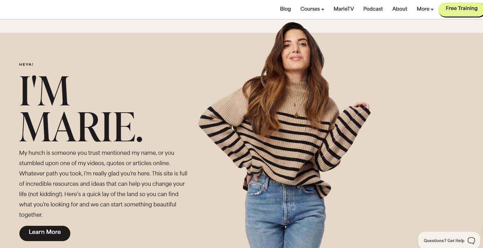
Entrepreneur, writer, and philanthropist Marie Forleo is a true inspiration for anyone who has checked out her work. Equipped with unbreakable confidence, persistence, and the passion to help you become the person you want to be, Marie makes sure to tell you what she is here for right away.
The hero section on her landing page is super powerful as it shows clips of her on the ‘stage’. The subtle use of black and white colors and other nude textures allows people to focus on Marie as a person, who appears to be friendly and inviting, with a smile that manages to bring out only positive emotions.
This encourages website visitors to keep scrolling through to learn more.
The effective use of white space makes the landing page look like a summary of a bullet point list that says everything that needs to be said. No more but no less either.
Finally, Marie links her podcast episodes and includes a photo gallery featuring people she worked with. She also encourages people to check out her course and book.
17. Kim Garst
Goal: Course sales (mini digital product)
Category: Marketing / digital products
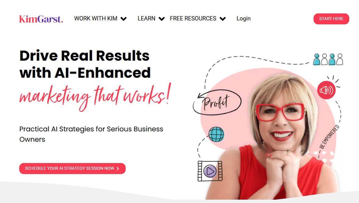
Marketing strategist, Keynote Speaker, and Live Video Evangelist – Kim Garst, knows her craft too well. On her website, Kim uses a short headline copy that tells what it is all about.
The sub-head goes one step further, explaining how you can do that while working with Kim. The CTA button that prompts users to start is positioned at the top of the page, which helps to make more conversions.
The little arrows and icons, and keywords, also have significance in guiding website visitors to the CTA.
Even the change in fonts in the copy eg ‘marketing that works’, draws bigger attention to it.
The section dividers give a unique flair to the web page. The landing page design is successful with a nice blend of three colors (red, purple, and cyan) that seem to match Kim’s style and personality. Kim recognizes the importance of building trust with her audience, so she strives to bring that element of authenticity into play.
While Kim has a lot to say on her landing page, she manages to structure the copy in a bite-sized manner that doesn’t overwhelm the reader.
18. Amy Porterfield
Goal: Email list growth and lead generation
Category: Online marketing / entrepreneurship

Amy Porterfield is an expert in the field of marketing. Her top-ranked podcast series and best-selling online courses are a major justification. In her early days, Amy launched many campaigns for Harley-Davidson and helped out motivational coach Tony Robbins. Once she got into entrepreneurship herself, though, Amy was able to help thousands of online entrepreneurs build a life and business they love and does so to this day.
And that’s the first thing Amy explains on her homepage. Using clear language, she uses her own copywriting skills to describe how she can help out. Her profile, along with her image, creates a strong and confident persona that makes it easy to trust.
With the use of a brief copy in each section, Amy wants to give as much information as possible. She leverages podcasting and invites people to check out her podcast, offering links to helpful resources at the same time.
These resources are the main focus because that’s where the top CTA directs the website visitor.
Overall, this is a great online course landing page example that shows how consistency in color, typography, and layout can create a balanced website that stands out from the rest.
How to create a course landing page in 6 easy steps
A strong course landing page is often the first interaction a learner has with your offer. Instead of focusing on design complexity, the priority is getting a clear, persuasive page live quickly. Using a drag-and-drop builder ensures your page is created without technical hurdles.
Here’s a step-by-step outline to set your courses up for success:
This approach keeps the process quick and easy, while ensuring your landing page highlights value and encourages signups.
Common mistakes to avoid in landing pages for courses
A high-converting landing page for courses isn’t just about what you include—it’s also about what you leave out. Sometimes, even a well-designed page can fall flat because of a few missteps that confuse or overwhelm visitors.
Here are some common mistakes that can hurt your conversions:
Overloading the page with information
It’s tempting to include every single detail, especially if you’ve worked hard on your course. But too much text—especially without bullet points or a clear structure—can make visitors bounce. Keep your key benefits front and center.
Stephen Gold, Business Owner, The Gold Standard, confirms that simplifying and decluttering is a conversion strategy, not a design compromise: “As someone who’s built hundreds of sales pages for cannabis businesses, the game-changer isn’t what you put on the page—it’s what you remove. Most pages try to say everything and end up converting nobody.
I stripped down a dispensary’s landing page to focus on just one thing: their flash sale countdown timer. Removed the lengthy product descriptions, testimonials, and multiple CTAs. Just the timer, the discount, and one “Shop Now” button. Conversions jumped 175% because visitors had zero decision fatigue.
The framework I use: One clear headline about the immediate benefit, visual proof it’s urgent (countdown timer, limited stock indicator), and a single action button. That’s it. When we implemented this for a client’s email-driven sales page, we saw a 2.5x increase in conversions compared to their old multi-section layout.”
Unclear messaging
If your headline and subheadline don’t immediately communicate what you offer and who it’s for, you’ll lose people fast. Your reader should know what your product or service is and how it helps them—within seconds.
Weak or missing CTAs
If your call to action is hard to find, blends into the background, or only appears once, it’s a missed opportunity. A compelling course landing page repeats its CTA and makes it easy for people to take the desired action at any point.
Forgetting about mobile
Your web page might look great on a desktop, but break down on a phone. If your buttons are too small, text too tight, or images unresponsive, it can kill conversions. A truly effective landing page for courses performs well on all screen sizes.
No social proof or trust elements
Leaving out customer testimonials, reviews, or guarantees makes your page feel less credible. Even one quote from a satisfied customer can make a difference.
Create your courses’ landing page with LearnWorlds
A high-converting online course landing page isn’t about being flashy—it’s about being clear, helpful, and intentional. Whether you’re building a long-form sales page for a flagship course or a simple layout for a quick launch, the goal stays the same: speak to your audience’s needs and guide them toward action.
Focus on what matters—your message, your visuals, and how each section builds trust and momentum. Use real results, clean design, and copy that reflects the transformation your course offers.
If you’re ready to start building—or updating—your next sales page, use the checklist above as your guide. And if you need help creating a full learning experience that sells, LearnWorlds has the solutions to support every step of your customer journey.
Get started today and see the results for yourself.

Rosemary is LearnWorlds’ Content Marketing Manager. She has over 2 decades of experience in omnichannel marketing and content writing for the IT and SaaS industry. Her expertise lies in crafting effective content marketing strategies that attract, engage, and nurture customers, enabling LearnWorlds to reach its target audiences with precision.

Kyriaki is the Organic Content Strategist at LearnWorlds, where she writes and edits content about marketing and e-learning, helping course creators build, market, and sell successful online courses. With a degree in Career Guidance and a solid background in education management and career development, she combines strategic insight with a passion for lifelong learning. Outside of work, she enjoys expressing her creativity through music.
FAQ
Everything you have ever wondered, but were too afraid to ask...
Conversion rates for an online course landing page vary widely and depend on factors like audience size, course pricing, niche, and page design.
A well-structured page that communicates clear outcomes, includes social proof, and has a focused call to action is more likely to perform better. Testing and refining your page regularly is the best way to improve results.
Driving traffic to a course landing page requires a mix of organic and paid channels. Popular approaches include sharing content on social media, building an email list, running paid ads, and partnering with influencers or affiliates.
Consistent search engine optimization (SEO) strategies, like blogging around your course topic, also help bring qualified visitors over time.
Related Articles