Table of Contents
Web design trends constantly change. And it’s all about bringing revolution while looking to the future or, we could say, living in it. Art, creativity, design, and technology all converge into web design. So, while the momentum is moving forward, website design today is all about the elements that will put an equally bright spotlight on the browsing experience.
Think about this: every day, an estimated 500k new websites are launched. So, how will you make sure yours stands out?
In this article, we are going to discuss some of the path-breaking design trends cherry-picked specifically for the online learning industry. We are already in the half of 2022, so our web design enthusiasts are going to demonstrate what’s moving the industry forward while revealing their inspiration and how you can stretch your creativity in 2022 and beyond.
Furthermore, our experts will cover how to apply key UX and UI design principles to your online academy to convert more visitors into learners (if you don’t already have one, no worries! Take advantage of it to get a head-start).
⭐And the bonus part: we are going to share our secret on how to create a professional-looking website for your academy with no designers or devs required. Cool right?
Let’s get started!
Table of contents
12 Top Web Design Trends for 2022
This year is characterized by playfulness, bold color palettes, gradient color schemes, and eye-catching typography. There’s also more emphasis on inclusivity and accessibility.
These 12 website design trends are what to look for what’s next in 2022:
1. Dark mode
The dark mode is making a comeback this year, adding an extra sense of sophistication to your website. Dark mode has a more practical functionality too: it’s also more restful for the eyes.
2. Oversized typography
An interesting trend this year is oversized, bold typography in the hero section or even in the headers. Bold fonts, even commonly used fonts like serif, look so impressive and stylish when oversized that they often steal the show from other graphic design elements.
3. Bold colors
Bold colors are also popular in 2022. Colors have the amazing benefit of evoking emotions; bold colors, in particular, catch our attention more than soft ones. Use bold colors wisely, in moderation, and at the right spot on your web page (e.g., for your CTA).
4. Minimalism (flat design)
A minimalist design is usually characterized by white space (which doesn’t have to be literally white) and offers visitors a “quiet” experience. Clean interface, essential-only text, and superior aesthetics draw visitors in and create a sense of elegance and professionalism.
5. Text-only
A bold but straightforward choice for those who really want to make a statement. Attract attention and get your message through in the most minimal, simple, and straightforward way possible. You can pull this off by using oversized fonts or a handwriting typeface.
6. Geometric designs
Geometric designs are still going strong in 2022, as they are versatile enough to fit in minimalist or maximalist designs. They can evoke playfulness or elegance depending on the elements they’re combined with.
7. Illustrated characters
Illustrated characters are back this year. And why not, since they’re friendly and add personality and color to a website! An excellent choice if you’re targeting younger audiences – and not only.
8. Micro-interactions
Micro-interactions are like salt and pepper to a website: they are pleasant surprises that add just a hint of spiciness. A micro-interaction is a small interaction when the user interacts with an element on a web page. For example, the guest hovers their cursor over an image, and a text appears.
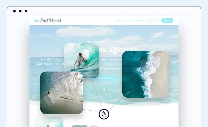
9. Parallax effects
Parallax design is still popular in 2022. It’s a technique web designers use to create depth and a 3D effect in their websites by enabling different backgrounds of the same web page to move at a different speed.
10. Inclusivity
Although not a strictly design element, inclusivity is all the more present in web design and it’s only expected to become more important in the following years. Inclusivity refers to accessibility, gender-neutral language and imagery, respect for culture, etc. A typical example is using alt text for your images to facilitate your visually impaired visitors. Another would be an image that defies gender stereotypes, like showing little girls playing football.
11. Scrolling text
Scrolling text is an exciting touch that increases user engagement as it prompts the site visitor to pause navigation for a moment and wait until the whole message is revealed. A great way to catch attention, often used with oversized or bold fonts, below the hero image.
12. Gradients
Gradients is another long-standing graphic design trend that has evolved over time. Gradients were traditionally used in the background to add depth, however now they are also used to fill in illustrations or fonts.
All-Time Classic UX and UI Design Principles To Organize Your Website
Trends are cool, but there are also some timeless principles that will never fail you when developing your website.
1) Keep it simple: Avoid overwhelming your visitors with too much information on your pages. Too many visuals and blocks of text create noise and clutter and, eventually, an uninviting online environment.
2) Use clear and concise language: Your website visitors should always understand what you’re talking about. Don’t try to make an impression by using jargon and pompous expressions. Instead, be conversational and use simple language that even non-native speakers can understand.
3) Use headings and subheadings: Break down the text into shorter paragraphs and use headings and subheadings to better organize the information and make it easier to read.
4) Place important information in the top left corner of each landing page: People usually read from the top left to the bottom right. Anything they shouldn’t miss should be there for them to read!
5) Use images and videos sparingly: Images and videos can slow down loading times and frustrate your visitors. Slow loading time can make users abandon your website.
6) Double-check your links: Make sure all links work correctly and lead to the correct pages.
7) Create a mobile-friendly website: Our mobile devices have more or less become an extension of our hands. So always create your content and visuals taking into consideration how they will appear on mobile devices.
Why You Should Build A Professionally Looking Website
It may come as no surprise to you or you already know the why behind this question. However, while the educational value of your course should be the main focus, let us stress that you should still strive to create visual interest with a good web design.
Make a great first impression
A sloppy or outdated web design will give the impression that your courses are the same way too. It’s as simple as that. You want to welcome customers to your beautiful “home” and show them that you have created a well-tended space for them.
Provide a better user experience
A website with a clean interface and intuitive navigation will provide website visitors with a better user experience. This means that visitors are more likely to stick around your website and discover all your products.
Inspire trust and convert
A professionally looking website will inspire trust in your clients, increasing the chances of them buying your courses.
Communicate who you are
Your website is a reflection of you. Whether you are a solo edupreneur, a coach, or a small business, your academy’s website should reflect your style and philosophy.
As insignificant as that may seem at first, being honest about who you are is the best way to give your audience a more accurate picture of your offerings and create the right expectations.
Improve your SEO ranking
Do you want to improve your school’s website visibility and get discovered by more people? Then, apart from building an SEO strategy, an attractive website is another way to do it.
A website will improve metrics like time on page and conversion rate and decrease bounce rate, “signaling” Google that your website is trustworthy and offers visitors what they’re looking for.
Stand out from the competition
Some course creators invest in a beautiful website, and others don’t. Which side do you want to be on? Stress your brand identity and keep it a notch above the others with a beautiful website worthy of your courses.
There are a few ways that you can build a website from scratch. But if you’re new to coding, your best options include hiring a web design company, learning how to make stunning websites via a course, or utilizing top-of-the-line templates.
What LearnWorlds Can Do for You
We want your online academy to have a beautiful website that makes visitors fall in love with the content and become lifetime learners!
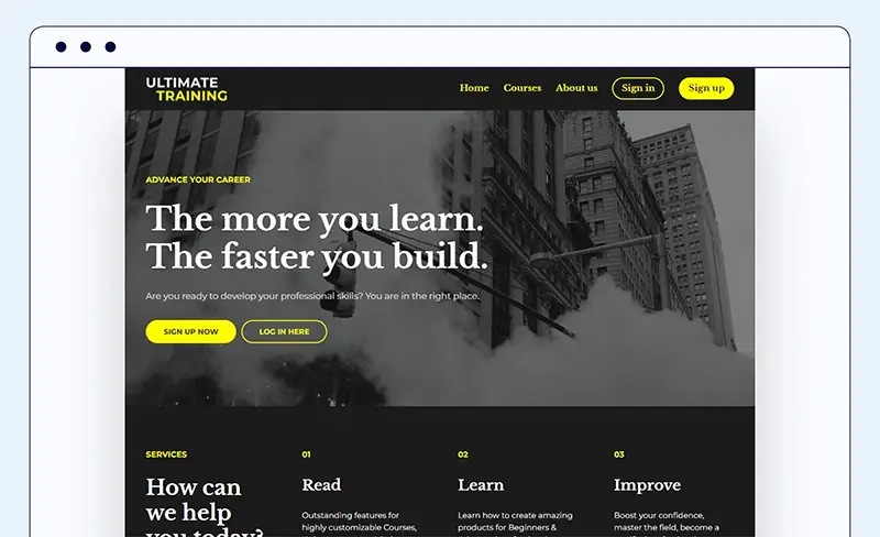
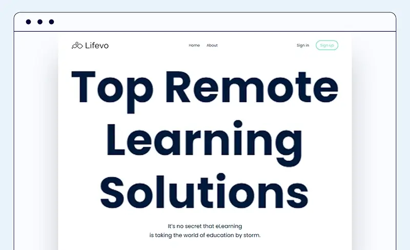
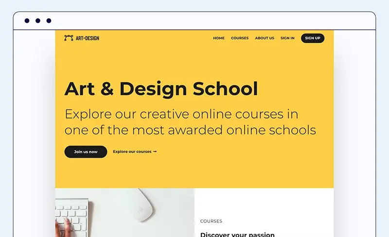
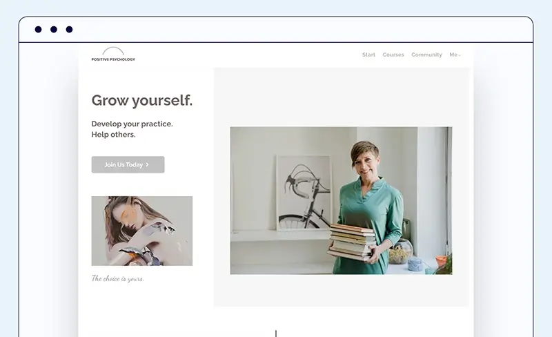
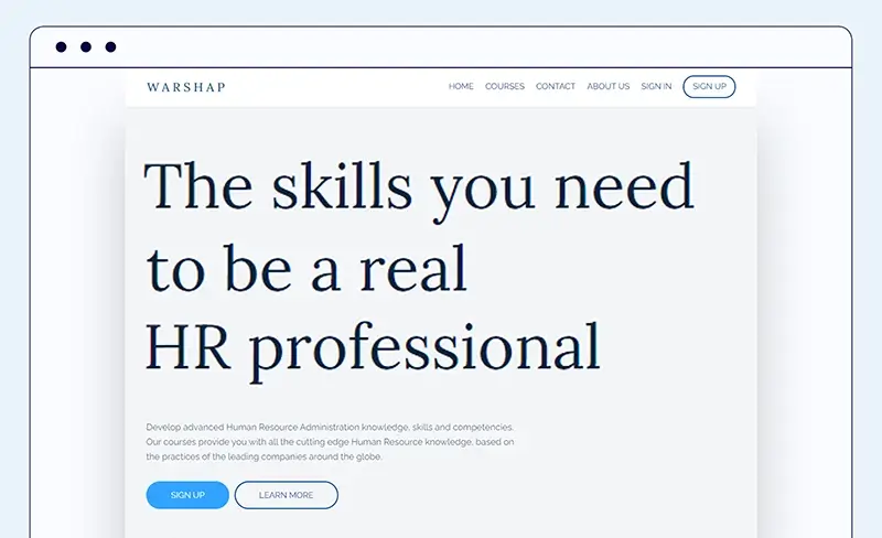
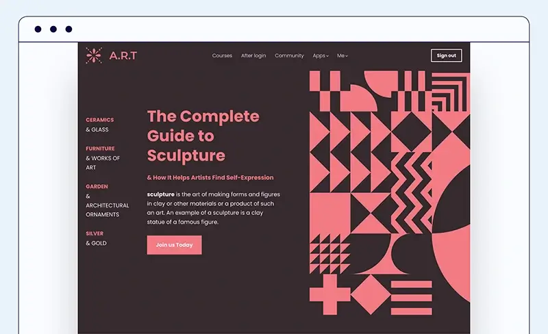
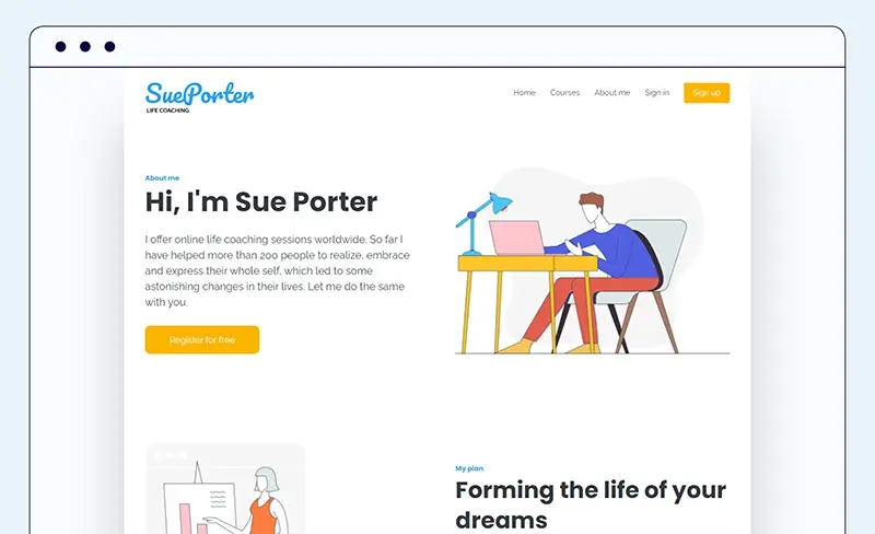
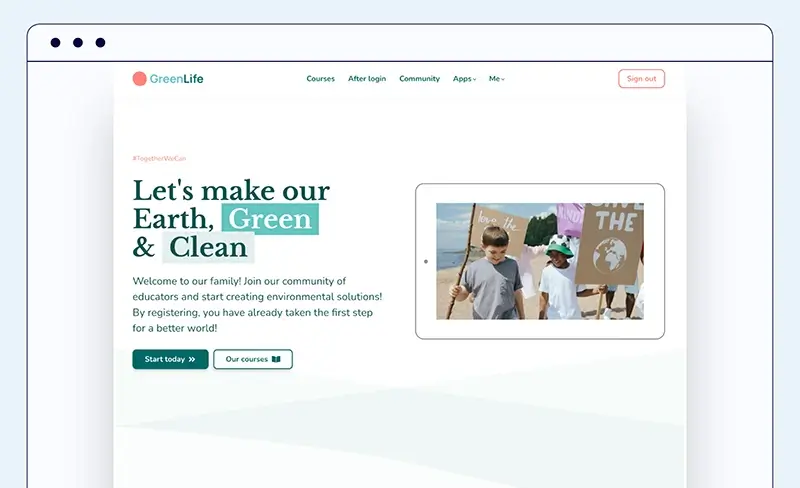
For this reason, we’ve just launched a new collection of 50+ professional website templates specifically designed to meet your industry needs: Art & Design, Coaching, Customer Education, NGOs, Health & Fitness, Medical, Nutrition, Professional…and many more.
Here’s what makes our beautiful site templates unique:
✅ Professionally designed templates that allow for an intuitive user interface and a seamless experience on your website.
✅ Industry-leading to meet the business needs of every niche.
✅ Ready to go – launch with confidence in the blink of an eye without one line of code, hassle-free!
✅ Want to play around a bit? Extreme personalization of typography and colors, so you can create the website you’ve imagined that better reflects who you are. Hundreds of widgets are available to customize the academy’s website you always dreamed of!
✅ Personalization via tagging and plenty of widgets to simplify the way you organize information and communicate news and offers with site visitors.
✅ User journeys made easy with one-click sales funnels, check out pages, forms, pop-ups, and so much more!
✅ Responsive on any device to offer a seamless user experience even on the go.
What Inspired Our Web Designers
So, what were the trends that caught our designers’ attention this year? What elements did they get inspired by to create LearnWorlds’ enriched collection of website templates for course creators to put into action?
Combining playfulness with sophistication
“Sense of playfulness, borrowing of style from the late 90s, and creation of websites as art are some of the new trends in web design. Simplicity, geometry, neutral tones, sophisticated textures, and rounded typography are the “must-have” elements in my designs. As born in the early ’90s, I took cues from that era, and by adding my personal touches, I created some of the new Leanworlds’ Site Templates.” Mairy Christaki
New trends adjusted for a positive User Experience
“In 2022 we see a lot of second chances for designs from the past, such as the ‘90s. People are experimenting and replacing the new with the old but with unpredictable and fun touches. Some of the top trends for 2022 are retro designs, visible borders, complex gradients, oversized typography, etc. For the new Learnworlds website templates, I tried to bring it down a notch by implementing small touches from the new trends and by designing templates that are easy to navigate, provide a positive experience for the students, and above all attract the attention of new leads with playful and creative designs.” Sofia Lampridou
Inspiration is all around us
“I like taking inspiration from my everyday life. I often feel inspired by walking, watching movies, reading a magazine, and observing nature and the world around me. It seems very intriguing to me to find patterns of shapes and colors in the outer world and transfer all these ideas into the digital world. Social media and online resources help me build a bridge between my design style and ideas and the current trends in web design. Bright and vivid colors, rounded shapes, and a flat design approach are the main elements of my new Learnworlds’ Site Templates.” Tina Biniari
Your academy design acts as your brand’s silent ambassador!
So, we have mentioned some of the path-breaking and emerging web design trends for 2022 and beyond, especially cherry-picked for course creators like you.
What’s coming next? More innovative and experimental design trends are on the way to enhancing engagement with visitors and improving user experience.
As always, we would love to hear about your favorite web design trends, so please do not hesitate to drop us a message.
Further reading you might find interesting:

Androniki Koumadoraki
Androniki is a Content Writer at LearnWorlds sharing Instructional Design and marketing tips. With solid experience in B2B writing and technical translation, she is passionate about learning and spreading knowledge. She is also an aspiring yogi, a book nerd, and a talented transponster.