Table of Contents
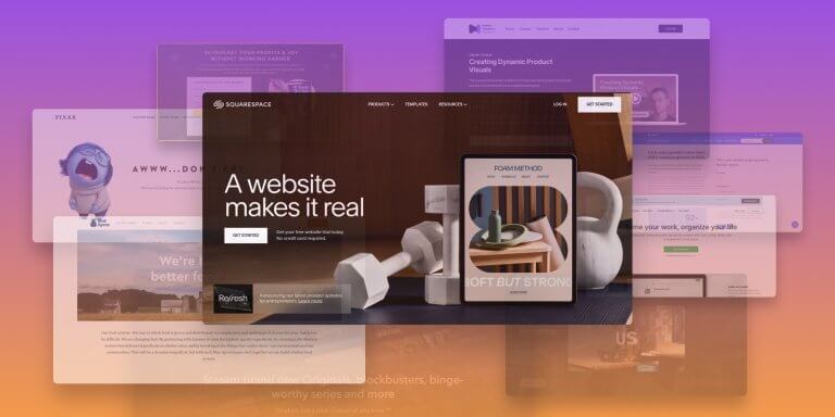
Landing pages are like a box of chocolates – they come in all sorts of fun flavors! Each one has a unique mission in your marketing adventure, and if you give them a little creative attention, they can make magic happen.
Among others, a well-designed landing page can help boost conversion rates and sales, collect contact info and demographic data of potential customers, or make a lasting impression on a first-time visitor.
Join us as we explore 17 diverse and most popular landing page examples and pick up some design tips along the way to create your very own stunning landing pages:
- 1Squeeze Page
- 2Lead Generation Landing Page
- 3Lead Capture Page
- 4Product Page
- 5Paid Advertising Landing Page
- 6Splash Landing Page
- 7Click-Through Landing Page
- 8“Get Started” Landing Page
- 9Short-Form Sales Landing Page
- 10Long-Form Sales Landing Page
- 11Video Landing Page
- 12“About Us” Landing Page
- 13“Coming Soon” Page
- 14Pricing Page
- 15“Thank You” Landing Page
- 16404 Landing Page
- 17Unsubscribe Landing Page
- Landing Page Design: 5 Quick Tips
1. Squeeze Page
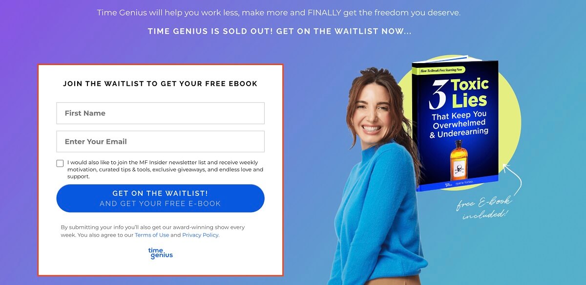
🎯 Main goal: generate leads and capture the visitor’s email address.
Squeeze pages are lead generation pages that focus on collecting email addresses from site visitors. They capitalize on the fact that email is the most effective channel in marketing communication.
So, after capturing the visitor’s email address, you can nurture the collected leads by sharing relevant content, exclusive offers, new product releases, and more.
The most common type of squeeze page is gated content or a prompt to enter your email address to receive a newsletter, ebook, whitepaper, a free trial, or any other content offer related to your online school.
Giving users something in exchange for their email helps build trust and increase customer loyalty.
👍 Rule of thumb: Keep the squeeze’s page design simple and easy to use. Make the call-to-action button (CTA) tempting enough for people to click and make it clear enough for mobile users to spot.
2. Lead Magnet Landing Page
🎯 Main goal: generate leads, collect contact information, start building trust.
Lead generation is at the heart of digital marketing. This type of page primarily aims to make a good impression. Collecting the visitor’s information is highly desirable and therefore, relevant forms are included on the page.
However, what differentiates your lead magnet page is that it offers something that will make site visitors like you and realize the value they can get out of your courses. This “something” is educational content, a free downloadable, customer testimonials, etc. Anything that will start building trust and add credibility.
👍 Rule of thumb: A lead magnet page is like making a new friend. It’s about getting to know someone, building trust, and then, if the time is right, asking for their contact information.
So, in this context, we call it a “lead magnet landing page” because its main focus is to capture (or collect) people’s information, like their email, without offering much in return. It’s like trying to get someone’s contact details without really getting to know them first.
On the other hand, an effective lead magnet page is more like starting a friendly conversation, getting to know each other, and then, when there’s trust and interest, asking if they’d like to try out the free trial or whatever you’re offering. It’s a more polite and effective way to approach things.
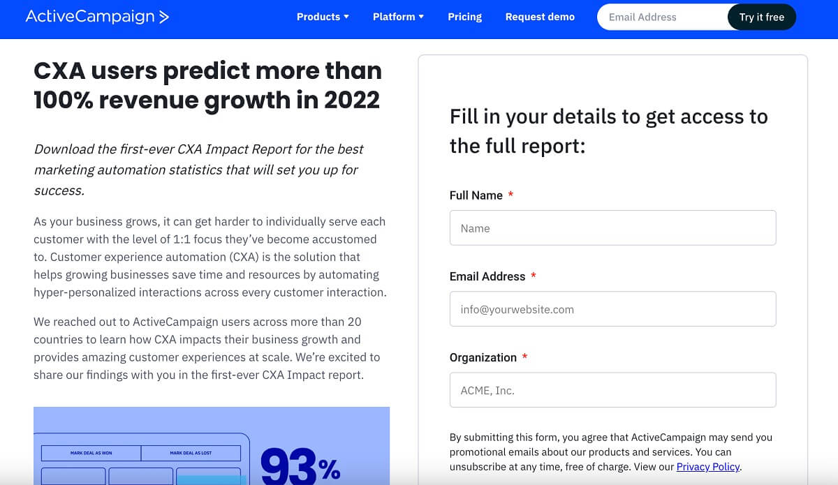
3. Lead Capture Page
🎯 Main goal: generate leads and collect contact information.
A lead capture page sources information from potential leads (e.g., full name, company name and phone number, job title, industry) and enables you to grow your email list.
The contact information you ask for on a lead capture page depends on your online school’s sales and marketing goals, as well as where the visitor is in the sales funnel. It’s similar to a squeeze page, but it asks for more information than a simple email.
When you have a lead capture page at the top of the funnel, it is a good idea not to ask for too much information. However, if a user lands on your lead capture page after downloading a case study or whitepaper from your online school’s resources page, they are more likely to provide additional information that will qualify them and guide them to the right course.
👍 Rule of thumb: Avoid asking the user for information they’ve already submitted through previous steps leading to the lead capture page. Likewise, do not request information that does not benefit your marketing efforts.
4. Product Page
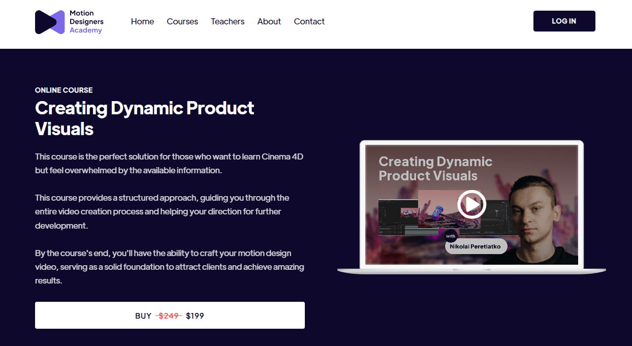
🎯 Main goal: introduce products, close sales.
A popular landing page for e-commerce sites to introduce product lines, but also for course creators to showcase their online courses, digital products, and memberships.
A product page is one of the most crucial types of landing pages for your online academy. Here, you must showcase the learning objectives (thus, the benefits for the learner) and offer as much practical information as possible, like a course curriculum, price, and instructor details.
This is also an excellent opportunity to upsell with discounts and coupons, limited-time offers, and course bundles. Including testimonials from happy learners (social proof) or a money-back guarantee will help visitors hit the buy button with more confidence.
👍 Rule of thumb: A product page must elude, first and foremost, trust. Emphasize the benefits of the course and bring social proof to the table, and don’t make it all about the price. If you’re a new creator, consider offering a mini course for free to get your first reviews. Check out our relevant post on building a mini course for lead generation.
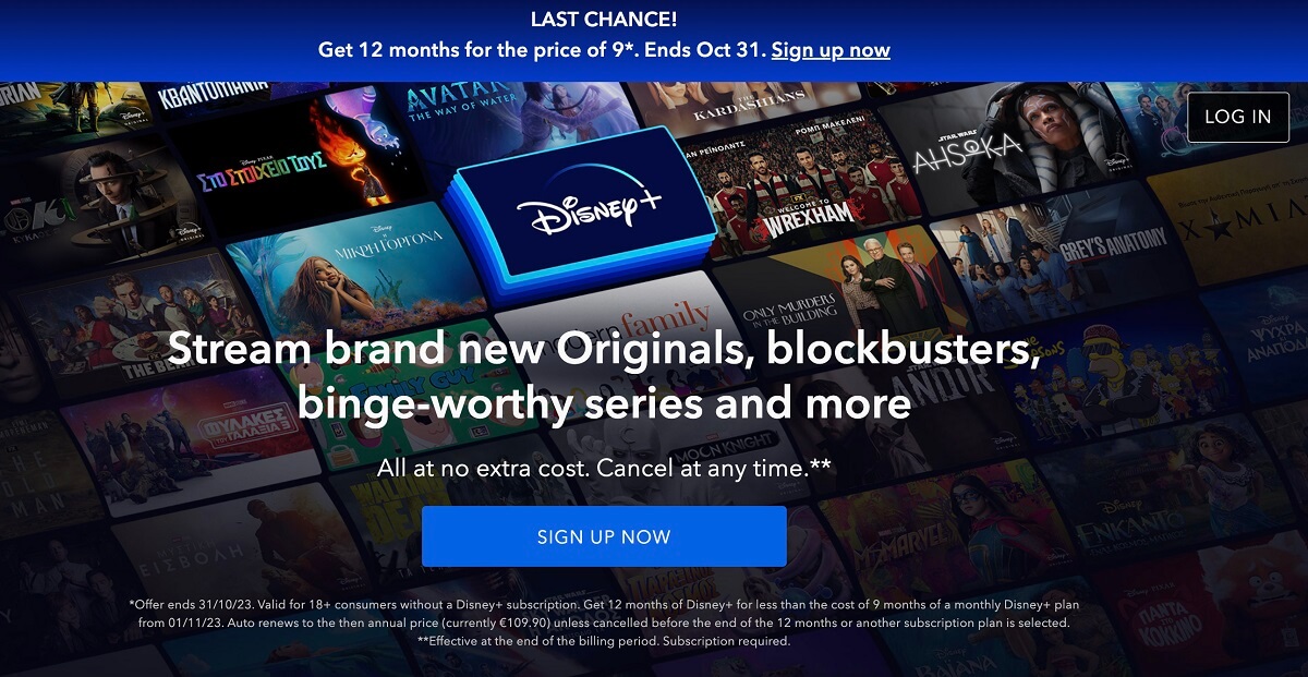
5. Paid Advertising Landing Page
🎯 Main goal: generate leads through PPC advertising without necessarily converting them into customers.
Paid advertising landing pages should provide users with more information about the topic of the ad they just clicked on.
In other words, if you have created a Facebook Ad for a specific online course you offer, then this ad should lead to a specific landing page about that course, not to the general section of your online courses or your online school’s homepage.
As with the lead generation landing page, the goal here is to generate leads, not necessarily close a deal.
You can think of this type of landing page as a squeeze landing page where users arrive via a paid advertisement. So, keep the information on this page light and ask users to provide you with their email address.
👍 Rule of thumb: A simple wording highlighting your online course is best, or better yet, you can use a video where you present and describe the online course topic and its structure, and you invite users to join your newsletter list for more interesting information by providing their email addresses.
6. Splash Landing Page
🎯 Main goal: welcome visitors and provide some primary information before they access the content you want them to see.
A splash page can be an intermediary page you can show to users who click on a social media link to one of your ads. For example, it can brief visitors via a video testimonial on how learners who completed one of your online courses improved their skills.
You can also use splash pages for general notification purposes about your online school, such as telling visitors your new online course is coming soon and showing a countdown, showing a maintenance notice, asking users to set their language preferences, or promoting your school’s social media profiles.
👍 Rule of thumb: Don’t overcomplicate the information you present to your users. Also, keep in mind that your splash page doesn’t necessarily have to capture leads as its primary goal.
7. Click-Through Landing Page
🎯 Main goal: provide value to visitors without bombarding them with a “Buy Now” button before they’re ready.
As an experienced course creator selling online courses, you probably already know that you a best practice is to provide value to your learners before asking them for money.
The click-through page shows off the elearning product’s features and benefits. The page also includes a call-to-action link that encourages visitors to purchase your online courses, bundles of courses, or membership to your online school. When users click on the CTA button, they are directed to another landing page to view pricing and proceed with a payment.
👍 Rule of thumb: Remember that the CTA button on a click-through landing page often takes users to a second landing page which provides pricing information. So, be sure you have answered most of their frequently asked questions about your elearning product. In the end, you want to encourage them to act without being insistent.
8. “Get Started” Landing Page
🎯 Main goal: put the call-to-action directly to the center of attention.
With the “Get Started” landing page, your offer is prominently displayed above the fold. It immediately lets visitors know what your online school has to offer and compels them to take action (click and convert).
Focus the text and heading above the fold on the main benefit or gain that your learners will receive from your online course. If visitors are hooked already then they will directly click to proceed.
The rest of the landing page can be used for them to scroll through to get more information if they still need more convincing.
👍 Rule of thumb: Focus the text above the fold on the main gain that your learners will receive from your online course. Be as specific as possible.
9. Short-Form Sales Landing Page
🎯 Main goal: lead generation.
A short-form sales landing page features basic information about your digital products. Here, you don’t need to go into extensive details – think about the site visitor is simply browsing. Just like they would do in a physical store before they single out the items that catch their eyes the most and start asking questions.
👍 Rule of thumb: Help site visitors decide what’s best for them without having to open and close a million tabs. The less friction, the better. List your course offering with key information only: key learning objectives and price. This makes your course title all the more important. Read our post on choosing a catchy name for your online course for some inspo!
10. Long-Form Sales Landing Page
🎯 Main goal: seal the purchase
A long-form sales landing page answers all questions potential learners might have about your online courses and removes any doubts they may have about why they should opt for your school.
In essence, a long-form sales landing page is a very enriched variation of a short-form page. It’s the short-form sales page multiplied. It has plenty of details about your online course, deep diving in benefits and features. It also combines benefits with social proof (e.g., testimonials), inciting users to click on the buy button.
👍 Rule of thumb: Start with a catchy header that explains in detail how your online course will help learners reach their goals. Additionally, you may include a video testimonial of a successful entrepreneur who has benefited from your online course.
11. Video Landing Page
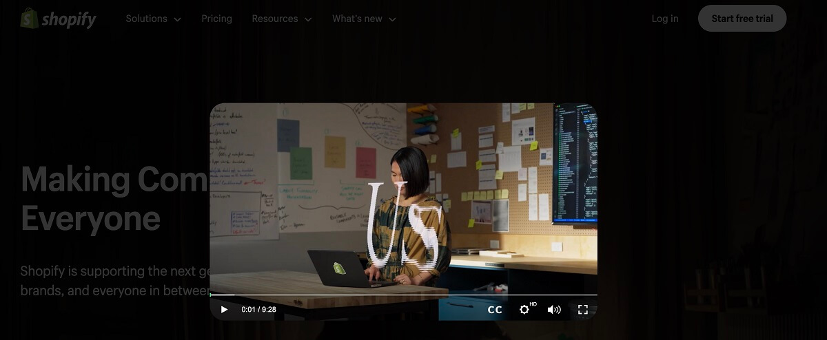
🎯 Main goal: engage site visitors, close a sale.
In this type of landing page, video is the protagonist. You can build a video landing page to introduce yourself or briefly present your online academy’s offerings and maybe an exclusive offer.
Video is a convincing medium – we don’t even need to tell you that by now. What better way to build a connection with site visitors than letting them put a face behind your courses.
👍 Rule of thumb: Ensure your video is concise and captivating, as the first 4-5 seconds are crucial for engagement. Keep the customer at the center of your message, emphasizing the benefits of enrolling in your course throughout.
Need the best tools for professional-looking videos on a budget? Check out our list of the top 35 video training software.
Need to feel more confident in front of the camera? Read these video tips from successful YouTube creators and get that camera rolling!
12. “About Us” Landing Page
🎯 Main goal: offer information about your online school and generate leads.
You can turn your “About Us” landing page to a lead generation page as well and add a call-to-action button (e.g., subscribe to our newsletter).
Your “About Us” page can reflect the history, vision, and mission of your elearning business, but it can also motivate users to take further action (e.g., download a lead magnet and/or follow you on social media).
You’ll be surprised to learn how many visitors will sign up for your newsletter after reading about your online school’s history, accomplishments, goals, courses, and mission.
Basically, this is a perfect place to capture their attention and make them interested in your online school.
👍 Rule of thumb: You can engage visitors to learn more about your business and contact you for a one-on-one meeting, to join your online learning community and spread your vision, or just to get them into your sales pipeline software. Many companies also choose to include a video narration.
13. “Coming Soon” Page
🎯 Main goal: create anticipation for an upcoming course and collect leads.
A “Coming Soon” landing page can be used to generate excitement and anticipation among your prospective learners for one of your upcoming courses. Visitors can also be prompted to enter their email address so they will be notified when the course is released so you can collect leads.
Ensure this landing page contains important elements, like the course’s launch date (add a countdown timer to create excitement) and the form users will need to fill in to be notified when the course goes live.
👍 Rule of thumb: Keep the “Coming Soon” landing page as simple and minimal as possible. Remember that you want to create excitement around your new online course. Avoid overloading the page with too many details about the course. You should focus on collecting valuable email addresses so you can leverage them for email marketing in the future.
14. Pricing Page
🎯 Main goal: encourage learners to make a purchase from your online school.
Unless you are offering strictly free online courses, then pricing is a factor you need to take into serious consideration when building your online school and creating your online courses.
It is important that your pricing page is one of the most heavily optimized pages on your site. People come to this landing page to determine if they should buy your online course.
👍 Rule of thumb: Add a set of testimonials from happy customers or create a mini FAQ section that addresses common questions before they even have to ask.
15. “Thank You” Landing Page
🎯 Main goal: express gratitude for subscribers, downloads, and purchases.
It may seem that a “Thank you” landing page serves no more purpose than simply expressing gratitude for an action performed on your other landing pages (“thank you for downloading our ebook, thank you for signing up for our online school’s newsletter”).
Well, you can actually make your “Thank You” page more effective by adding additional offers or giveaways. This is a great opportunity for you to provide something more worthwhile to an already motivated, interested customer. Make the most of it.
If a learner has just downloaded an ebook you created on best time management, you can directly provide them with an offer or coupon code to purchase your online course on “Time Management Techniques & Best Practices.”
👍 Rule of thumb: Keep in mind that there are a lot of things you can offer on a thank you page. You can suggest relevant online courses you offer, you can ask users to follow your social media profiles, and you can even ask them to write a review about your online school.
16. 404 Landing Page
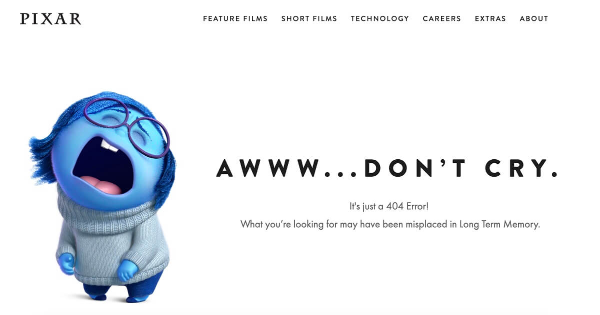
🎯 Main goal: inform users about a non-existent page on your school’s website.
A “404 Landing Page” is no good news for anyone, clearly. Right? Not exactly! Landing pages are often overlooked and misunderstood. You can actually turn this to a lead generation page or even to promote your online courses or other elearning products you may offer.
Besides, you can provide visitors with the option of visiting your blog, checking out your online courses, browsing your free resources page, or even signing up for your newsletter.
👍 Rule of thumb: Be as creative as your branding allows you to be. You can, for instance, use humor to overcome the discomfort that visitors may experience landing on your 404 landing page instead of the page they expected (e.g. Aliens have abducted this page, but guess what? We managed to escape and have created this amazing new online course. Hurry up, go to this new course page before they find you too).
17. Unsubscribe Landing Page
🎯 Main goal: make unsubscribing as easy as possible.
Everything you do related to your online school should be considered an online learning experience across the board. While you are not going to direct users to your unsubscribe page, many will simply wish to opt-out of your newsletters. You want them to be able to do this easily, so that they can continue to have a smooth experience with your learning business.
Additionally, you might have multiple newsletters based on the topics of your online courses. Learners should have the option to configure their preferences and choose which topics they want to continue receiving newsletters from you. You should direct them to this page to configure their preferences.
👍 Rule of thumb: Keep in mind that this landing page can also serve as a re-subscription page for your newsletter. No matter what, just because they’re not interested in receiving your emails does not mean they won’t browse your online school. Help them have a smooth experience.
Landing Page Design: 5 Quick Tips
Let’s put together everything we’ve pointed out throughout this post for designing eyecatching landing pages with high potential for conversions.
🎨 Visual design: Use images, GIFS, and videos to bring life to your landing pages. Add interactive and “moving” elements, like buttons, sliders, and countdown timers. Color is important as well, since it has a strong psychological effect and can impact your visitors’ first impression and next steps. Read our post The Top Colors for eLearning and Why They Work so Well for tips on how to pick the best colors for your website and course environment.
🖋️ Copywriting: Words are also of the essence; they need to be catchy and in the right tone of voice for your target audience. Your copy should be short and customer-centered – don’t make anything about you. Clearly mention the benefits of joining your courses and any running offers.
🤩 Credibility: Social proof inspires trust, so don’t be shy to use testimonials from happy learners. Give learners an incentives for an original review or use feedback they’re already shared with you and turn it into quotes.
🥇 SEO: search engine optimization (SEO) has nothing to do with design, but it’s good to implement basic SEO practices on your landing pages (like using keywords) to appear higher among search engine results.
🎯 CTA: Your call to action (CTA) should be short, concise, and action-oriented , and it should focus on the site visitor. For example, it’s best to say “Download my free eBook” than “Download your free eBook.” Another tip that works it to make the benefit/learning objective part of the CTA, e.g., “Become a confident speaker now.”
Build The Perfect Landing Page for Your Online Academy with LearnWorlds
Whatever landing page caught your eye, you can craft it with ease using LearnWorlds!
Our Website builder is your secret weapon, allowing you to create a wide array of landing pages that will captivate your audience.
Choose from our selection of pre-designed templates or start from scratch with a Blank page – the canvas is yours to command! Personalize them to perfection, ensuring they align seamlessly with your brand identity. Add sections and widgets to elevate user engagement, and if you’re looking for complete customization, you can even implement custom code.
With LearnWorlds, the sky’s the limit when it comes to making your online academy shine – Get started today with your very own 30-day free trial.
Further reading you might find interesting:

Androniki Koumadoraki
Androniki is a Content Writer at LearnWorlds sharing Instructional Design and marketing tips. With solid experience in B2B writing and technical translation, she is passionate about learning and spreading knowledge. She is also an aspiring yogi, a book nerd, and a talented transponster.